Tasks
- Summarize my path through the course
To France and back
On September 14th my Geography of the Western Front class travelled to France for 10 days to study the battlefields of World War I, more commonly known by Europeans as The Great War. The first city we stayed in was Hardecourt-aux-Bois. This city is really close to the Hawthorn and Lochnagar craters and is in the heart of the Somme. Visiting the memorials and battlefields of the Somme are really what drove me to want to focus on The Battle of the Somme for my final project. Some of the WWI memorials we went to were absolutly beautiful. Knowing what I wanted to focus on, I then needed to decide what direction I wanted to go with it.

This is a picture from the Vimy Ridge Canadian WWI Memorial
Before we had left my professor, Joe Hupy, showed us a story map of The Battle of Gettysburg. I really wanted to do something similar to this. I wanted to be able to show on a map how the front lines moved throughout the battle. I also wanted to be able to display some of the locations that I had visited while in France. So I guess you could say both the Gettysburg story map and my own personal experiences in France were my inspiration for my final project.
*** At this point I knew I wanted my final project to focus on The Battle of the Somme, I just wan't sure how my project would be presented.
Story Map Try-outs
When we got back from out trip our professor decided to have us create story maps. The story maps were meant to familiarize us with the programs and help us decide which one we would want to use for our final project. The first program we used was created by Esri. This kind of story map was nice because there were a lot more things you could edit on it and really make it your own. Another pro to using the Esri Story Map was that Esri is probably the most welcomed format within the geography community. Everything geographers use now seems to be run by Esri. The down-side was that the site wasn't very user friendly. Some of the editable features were difficult to use. My Esri Story Map focused on the second day of our trip; Day 2 in France.
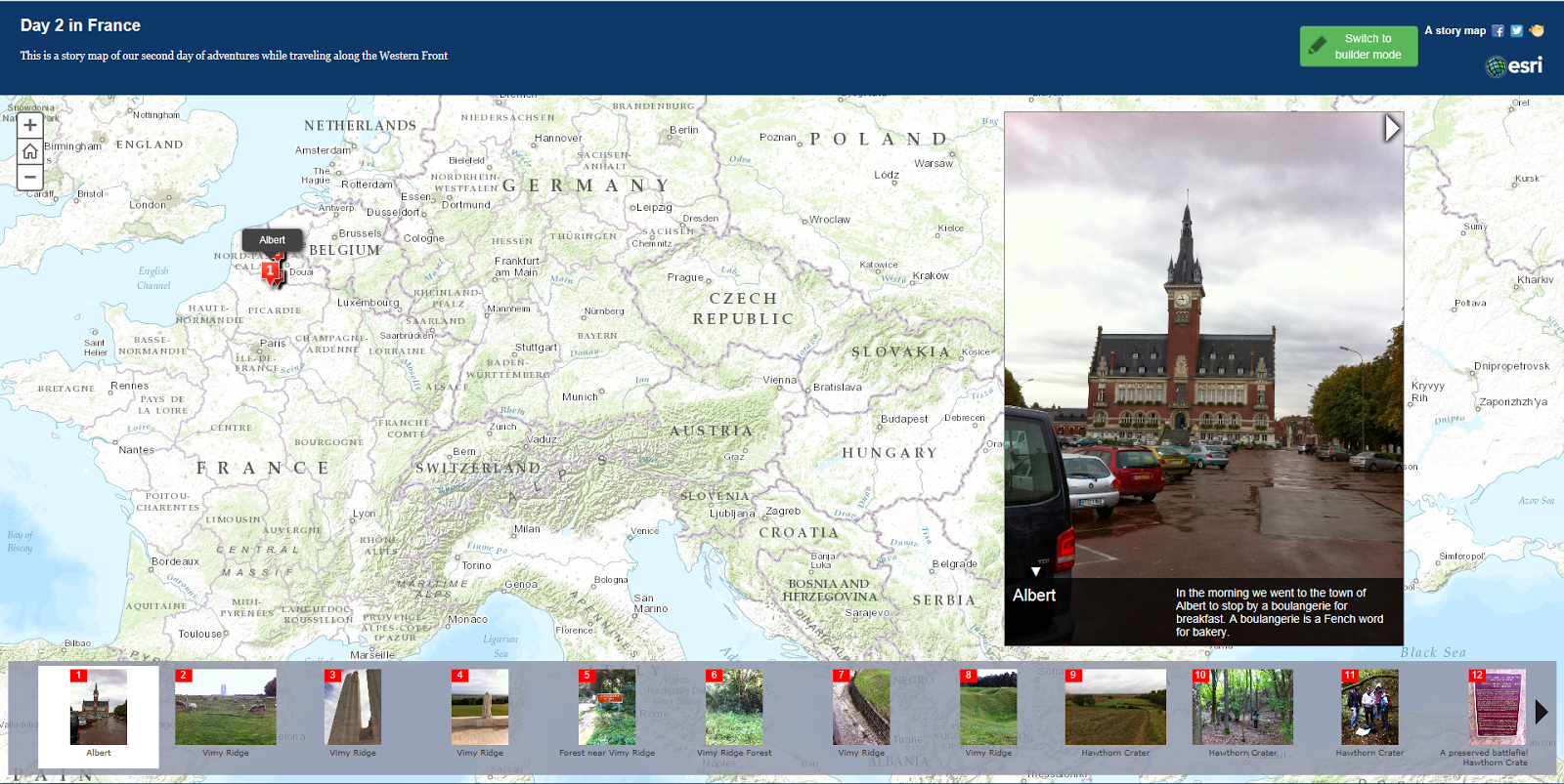
My Esri Story Map of the second day of our trip to France
The next and final story map we tried out was created by Google and it is called TourBuilder. I also liked this type of story map, but for different reasons. The TourBuilder program was extremely user friendly. It was very simple to use and took no time at all to figure it out. The cons about this program were that there wasn't as much you could edit on it, so everyone's story maps had the exact same format. Very unoriginal. Another thing that isn't great about this site is the Google isn't as high praised as Esri. My TourBuilder Story Map focused on the memorials we visited from WWI; Memorials of WWI.

My TourBuilder Story Map of the memorials of WWI
*** At this point in the semester I was planning on creating an Esri Story Map on The Battle of the Somme using the Gettysburg format. My hope was for my story map to look very similar to the Gettysburg one. It would be an interactive map that would show the progression of the front lines across the western front.

*** At this point I was really just in the gathering of information mode. Even though I was unsure of where my final project was heading I knew I would need a lot of information. So for the time being that was where my focus lied.
Foundation of Research
After completing those two sample story maps I began to go more in-depth with my research on The Battle of the Somme. I already had a solid base of knowledge from my trip to France and learning the essentials from the battle, but for me to make a final project that goes above and beyond I knew I would have to dig a little deeper and find some information that not everyone else knew about. When I first presented my blog post with the information I had found on The Battle of the Somme it mostly consisted of things that I had learned from the assigned text and the France trip. While I'm not going to go over every source that I used for my project I will share my favorite source. I used a lot of sources for different things. A lot were used for finding different maps of the Somme.
My first favorite source I used was from Spartacus Educational who had an amazing site giving a brief overview of the entire Battle of the Somme. A lot of what we learned while we were in France was about the first day of battle because this is when the most significant events happened. This site went beyond that and explained It did give a description for the first day, but after that it explained the rest of the battle as well. The author proceeds from that first day and talk about the front line changes from July 14th, September 15th, and finally to November 18th at the end of the battle. It explains significant events that led to the front line moves and the reasoning for the end of the battle, or at least a hypothesis for the ending of the battle. This site really helped me gain a greater base of knowledge on The Battle of the Somme for my final project.

*** At this point I was really just in the gathering of information mode. Even though I was unsure of where my final project was heading I knew I would need a lot of information. So for the time being that was where my focus lied.
ArcGIS Online
ArcGIS Online is the site that the Esri Story Maps came off of. You would pick your basemap and then insert that into a story map and add pictures to different places on the map. Well instead of inserting the map into a template right away I found out that the site lets you draw on the basemap. When I found this out I decided to draw the front lines on the basemap using the Map Notes tab.

Front lines of The Battle of the Somme
This was the map I used most to help me draw the front lines on the basemap. I spent quite a lot of time tinckering around with this and trying out different features. Once I finished drawing the front lines I was able to add descriptions to the features that I had just created. I added a short summary to each front line movement.
After I finished drawing the front lines I decided to add the two craters that we had visited while we were in France, the Hawthorn and Lochangar craters. These were symbolized by red triangles with an exclamation point in the middle.
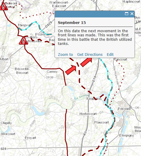
A screenshot of what my project looked like up to this point
*** At this point in the semester I was still hoping to find a way to use what I had just drawn on ArcGIS Online to create something similar to the Gettysburg map. I was also looking for a Story Map template to incorporate what I had just created. I had more of an idea of what I wanted to do than a direction of where I was going with it.
Additional data research
After I had the front lines for July 1st, July 14th, September 15th, and November 18th drawn on my map I realized I would need more information represented on my map, it was looking rather blank. My first decision was to add all of the larger mine explosions that occured on the first day to my map. At this point I only had the Hawthorn and Lochnagar craters on my map. Through using several different sites I was able to find the locations of the Triple Tambour, Y-Sap, Bulgar Point, and Casino Point mines.
Although this is more information that was being added to my map it was still looking rather blank. When I came across this next site I immediatly knew what would be next to go on my map. This source, Commonwealth War Graves Commission, focuses on the individual battles withing The Battle of the Somme. So on my map I illustrated each of these smaller battles, which helped show the progression of the Allied troops as they pushed back the imposing German forces. The author did an excellent job describing the events leading from the beginning of the fighting near the city of Albert on outward towards the city of Bapaume and the final front line move on November 18th.
*** At this point in the semester I had all of my information about The Battle of the Somme collected, I just had to figure out how I would display it onto my map. Also I continued to think about how I wanted to present my final project.
Adding new information to my map
I began with adding the mine explosions to my map. I created a new feature class using Map Notes and I placed an orange icon in the places where mine explosions occured. I then added a small bit of information about each cratered area in the description section. Some craters like the Lochnagar Crater only had one mine explosion in that location. Others, like the Triple Tambour site, had multiple mine explosions all in one area. Regardless of the number of explosions, each area only received one orange icon to maintain the maps neatness.

What my map looked like after the addition of the mine explosions
After the addition of the mine explosions I began to add each of the smaller battles on to my interactive map. There were twelve of the smaller battles in all. One problem I had while illustrating these battles was that I wasn't sure how to display them on my map. I came to the decision of circling the areas of emphasis and putting a flag near those areas that contained information about the battle. Green flags were used for successful battles. White flags were used for battles that either failed or were not a complete success. While this worked well for the areas that were taken over by the Allied troops, some of the battles were assaulted that started at one city and progressed to another. These types of battles are displayed with using hollowed out arrows pointing in the direction of the assault. There was then no need for the informational flag because the arrow feature could hold all of the information.

Battle type number 1

Battle type number 2
*** At this point in the semester I finally had all of the information that I wanted displayed on my ArcGIS map. I was still unsure of how I was going to display my map, but I was finally getting close to a final project.
Presentation
While I was looking through all of the Story Map templates that are hosted on the ArcGIS Online site I came across something. Every time I would go to work on my map I would click open and then click open in ArcGIS.com map viewer. There were always other options, but I never bothered to open my map in any other program besides the one we had been working with all semester. I decided to open my map in ArcGIS Explorer Online.

This is the screen that my map opened up into
I was able to turn on and off all of my features just like the other program, but this one had a different function. I clicked on the Presentation tab and I realized how I was going to present my project. The Presentation tab gave me the ability to insert my map and features into a slideshow format. I started off with the first day of fighting with the caption "July 1st" and turned on the July 1 and crater explosion features and turned everything else off. I did this to show all of the battles also. I progressed through The Battle of the Somme slide-by-slide. You can still click on features to see the information I wrote about them. The only thing this format wasn't compatable with was the pictures I attached to the information, so I had to delete those. Other than that I love this format and I believe it displays my research and map excellently.
My Final Project: The Battle of the Somme: Front Lines
Final Website: Geography of the Western Front
No comments:
Post a Comment